
Profit Loss Graphs for Puts
A Putis the option to sell a stock but not a requirement so there is no risk except for the initial price.

You can see this in the graph, after the stock goes above $200 the line is flat meaning that you can’t lose any more money. In this same area you can see that the value (loss) that the line levels off is the cost of the option.
As with all option graphs you notice there are 2 lines, a pink line and a blue line. The blue line is the value of the option at the day of expiration. The pink line is the value today. You can see that above the strike price the blue line is at your max loss, the cost of the put, however the pink line still has value, this is an easy way to see your time value.
If you were short a Put the graph would be the following

We have just covered all the basic structures of stocks and options. You can buy or short a stock, buy or short a call, and buy or short a put.
Now lets start going Advanced!! lets combine some graphs and start talking about synthetics. Synthetics is when 2 trades are made up of different components but are synthetically equal to one another.
One popular strategy is to buy a stock and then sell a call on it.
Call:  Sell a call:
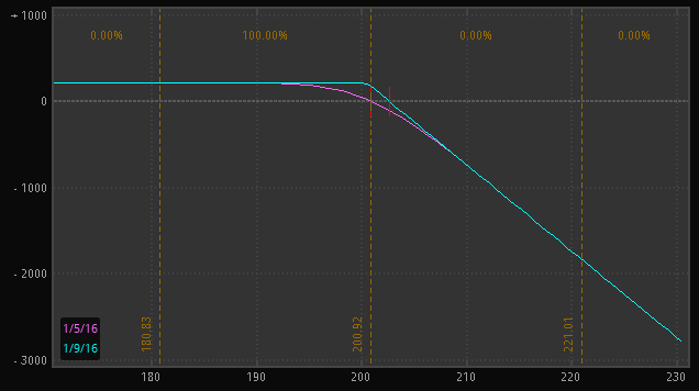
In this exercise to combine the graphs, I’m not going to be concerned with the values but only the overal shape of the graph. To combine the graphs you add the slopes of the 2 graphs for that price along the X axis. At the left side of the graph the stock graph is sloping up and the short call is flat. Sloping Up plus a flat slope is sloping Up. Then when you get to the strike price, the slope of the stock is still up but the slope of the call is now down (negative). So Up plus down cancel out and result in a flat line. Once you’ve combined those 2 regions you get the covered call graph
Which you will notice is the exact same graph that was shown earlier for the short put, this shows that a covered call and a short put are synthetically equal.
Bob Bullock
Contributing Writer