
Profit/Loss Graphs for Calls
Options are where P/L graphs get interesting. Options aren’t straight lines! Let’s look at Call option and see what the graph shows.
A Call is the option to buy a stock but not a requirement so there is no risk except for the initial price.
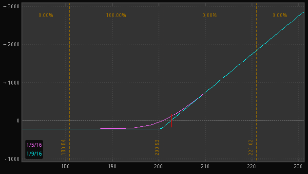 You can see this in the graph, after the stock goes below $200 the line is flat meaning that you can’t lose any more money. In this same area you can see that the value (loss) that the line levels off is the cost of the option.
One more thing that you notice on the graph is that there are 2 lines, a pink line and a blue line. The blue line is the value of the option at the day of expiration. The pink line is the value today, and this example i bought the call today. You can see that below the strike price the blue line is at your max loss, the cost of the call, however the pink line still has value, this is an easy way to see your time value.
If you were short a Call the graph would be the following
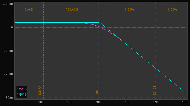
Just like the stock graphs, when you short an option it is the flip side of the long option. One other thing to notice is that time value is now working for you.
Whenever the blue line is above the pink line, the value of the profit will go up as time passes.
Bob Bullock
Contributing Writer