Profit Loss Graphs for Stocks
Here is the P/L graph for owning (being long), 100 shares of SPY when it was trading around $200.
 You can see that if the stock moves up $10 to $210 then your profit would be $1000. To do this you just look at $210 on the horizontal axis and see where the purple line is vertically. If the stock price dropped to $190 then you would lose $1000.
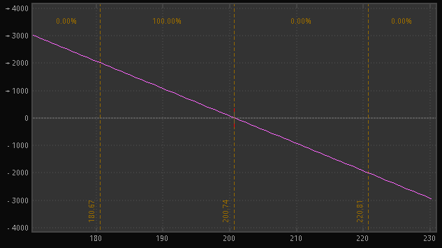
The opposite of being long 100 shares is to be short 100 shares.
 You can see from the graph that as stock price goes up you lose money and as it goes down the profit goes up.
One thing to note is that long and short graphs are the opposite of one another, they are flipped upside down compared to one another.
Being Long or Short stock have pretty simple graphs because they are just straight lines and they do not change with time or volatility.
In later topics I will talk about combining graphs. What would happen if you combined these 2 graphs? Without thinking about it graphically, you can think about it logically. If you bought 100 shares at $200 and then immediately sold them also for $200, you would have $0, The same if you bought it at $205 and sold it at $205. Now if you look at it graphically, an upward sloping line combined with a down sloping line cancel each other out and you are left with a horizontal line.
Bob Bullock
Contributing Writer
